History: Theme Changes in Tiki 25
Preview of version: 8
Tiki 25 is a kind of milestone release with many significant new features and revamps and upgrades of existing features and technologies such as the migration from Bootstrap 4 to 5. Regarding themes, here are some changes.
New themes
Two new themes have been added to the themes included with Tiki: Boosted and Neubrutiki. More information about these will be added to this page soon.

Boosted
Boosted is an implementation for Tiki Wiki CMS Groupware of the Orange Boosted theme (MIT license). "Orange Boosted is a Bootstrap based, Orange branded accessible and ergonomic components library." Because Tiki already has the Bootstrap vendor files, this implementation uses just parts of the Orange Boosted package. The Orange Boosted files and directories are used unedited and identified in comments. This implementation is a work in progress and not all details are integrated at this time. The original Orange Boosted source, further information and examples can be found at https://boosted.orange.com.
Neubrutiki
This is a new original theme for Tiki Wiki CMS Groupware, done in the neubrutalism design style. For more information about neubrutalism, see:
- https://youtu.be/uHX3oTCFJzw https://hype4.academy/articles/design/neubrutalism-is-taking-over-web
- https://dribbble.com/tags/neubrutalism https://colorswall.com/palette/189749
- https://designingforuncertainty.com/2022/04/03/neubrutalism-is-taking-over-web-design/
The Neubrutiki theme comes with one child theme, "Bordered" which has additional bold borders on some page elements.

Revamped themes

Ohia
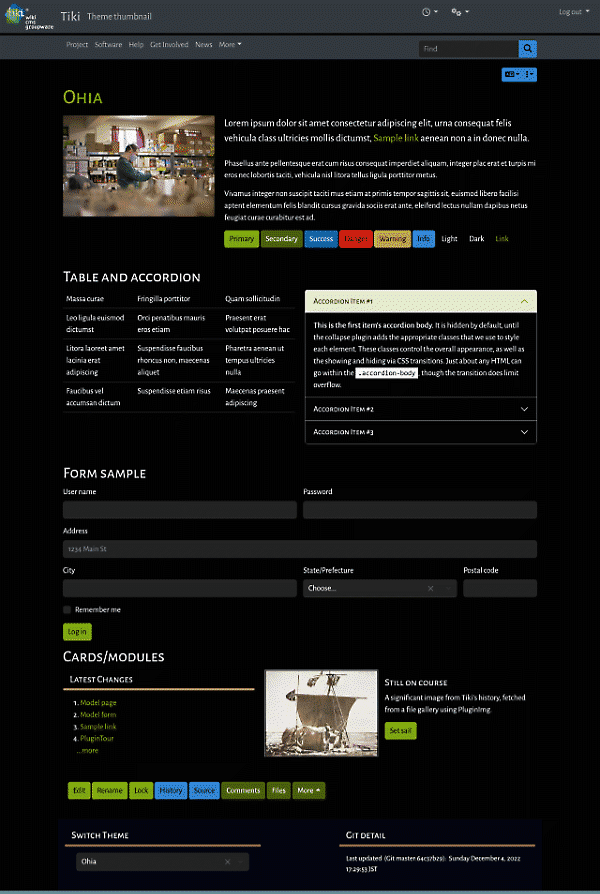
The Ohia theme was thoroughly overhauled so that its color palette is less extreme. From the beginning its colors were based on what you see around Ohia trees in Hawaii but this wasn't really done well originally. The new palette is a better representation, dominated by the gray color of cooled lava (ohia trees are among the first plants to take root after lava has cooled.
Darkshine
The retro-ish Darkshine theme should be easier for site admins to configure now, as styling and layout for its top and topbar module zones have been revised for Tiki 25. More information will be provided on its theme page here soon.
Retired themes
Both of the Strasa child themes, Cool and Mono, have been retired, as have been all of the Jqui child themes except for Trontastic. They were removed because they didn't contribute much to the variety of included Tiki themes. For the most part, they could be replicated by using CSS variables in Look & Feel admin CSS customization. Jqui's Excitebike theme was more interesting graphically but wasn't close to meeting WCAG color contrast minimums and if the time was going to be spent fixing it, it would probably be better to devote the time to a new, more contemporary theme.
Revised method for child themes
For child themes that have a significant amount of color variation in elements like buttons, relative to the parent theme and/or "sibling" themes, now Bootstrap SCSS partial files are used, similar to in a standard theme, rather than copying and modifying CSS. This is a more robust method and makes theme maintenance easier. Fivealive, Fivealive-lite, and Jqui child themes now use this method.
CSS variables
New in Tiki 25 is the ability to use CSS variables to easily change the background and foreground colors, and site title font sizes, in the top and topbar zones, where typically navbars are used. There are also CSS variables for the new Unified Admin Backend navbar and aside menu elements, and for pagetop padding. See CSS Variables in Tiki for more details.
Previously, there were dark and light options for navbars, and these were set for every navbar. With the new CSS variables, it's possible to easily specify one set of dark foreground and background colors for the top navbar and another set for the topbar navbars. See Pagetop Styles and CSS Variables for more information.
WCAG compliance (web accessibility)
As themes were updated for Bootstrap 5, they were checked to see if they met color contrast standards, and edited accordingly if they didn't. Compliance isn't 100%, because much depends on the particular HTML and page elements and so on being tested, but there's been considerable improvement. This includes the Bootswatch themes that Tiki is using, as there were quite a few instances of insufficient color contrast in these themes also. We'll check about upstreaming our changes. More specifics about WCAG compliance testing are coming soon.